This project was done during my Master's degree at the Design School Kolding. The client for the project was Ellekær youth club in Åarhus, Denmark. The challenge was: how might we enhance a sense of ownership and create a stronger identity for the youth club involving kids? I was involved in all steps of the design process and I was one of the lead graphic designers, in charge of creating the typeface and branding.
We conducted a series of interviews and playful workshops together with the kids and pedagogues at the youth house, as part of our research process. We wanted to focus on ownership in order to create a stronger sense of identity. For the final solution we have created a typeface together with the kids, that we have translated into branding and various physical objects the kids can interact with. We successfully pitched our idea to the client in the end.
Designers
Ksenia Grigoryeva, Syuan Yun Huang & Jielin Chen
2020

Process
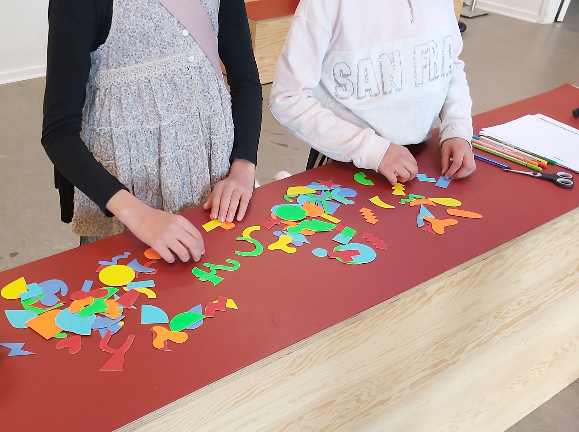
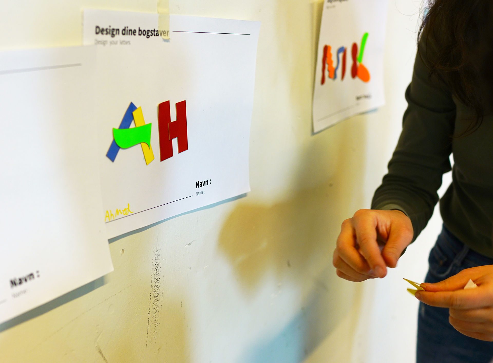
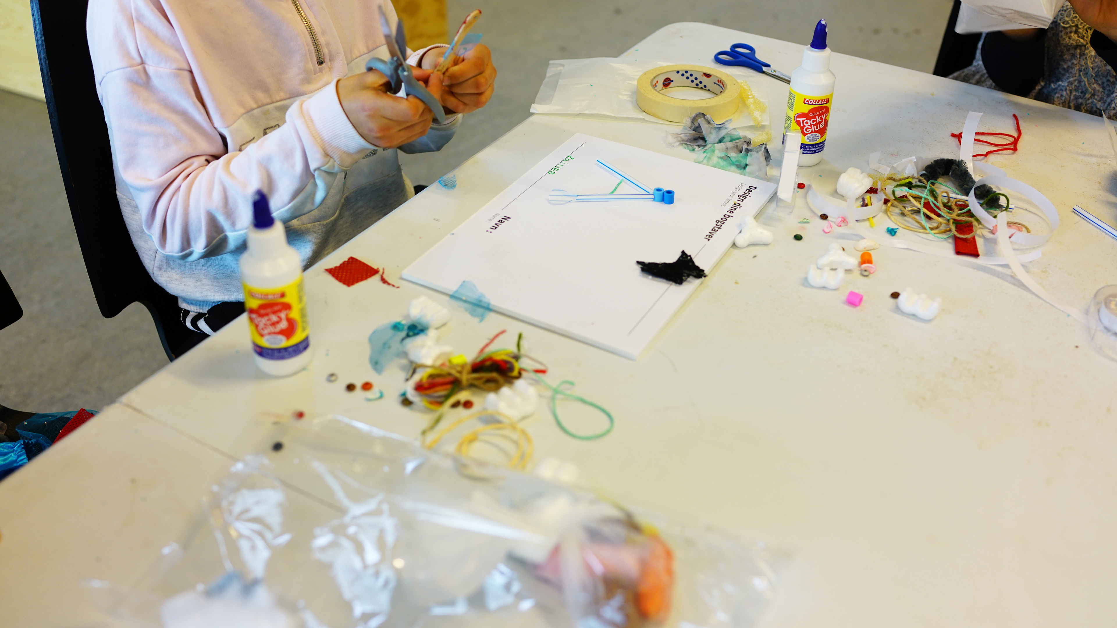
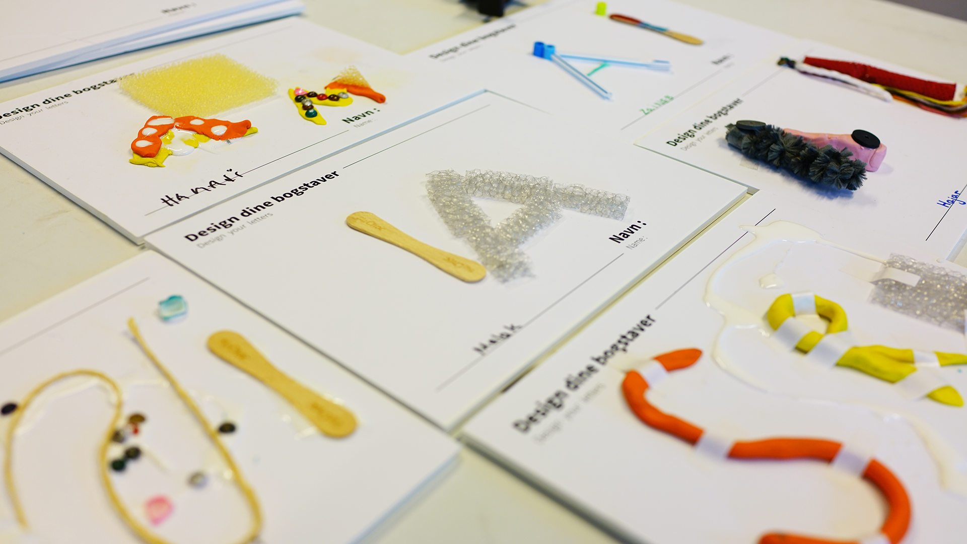
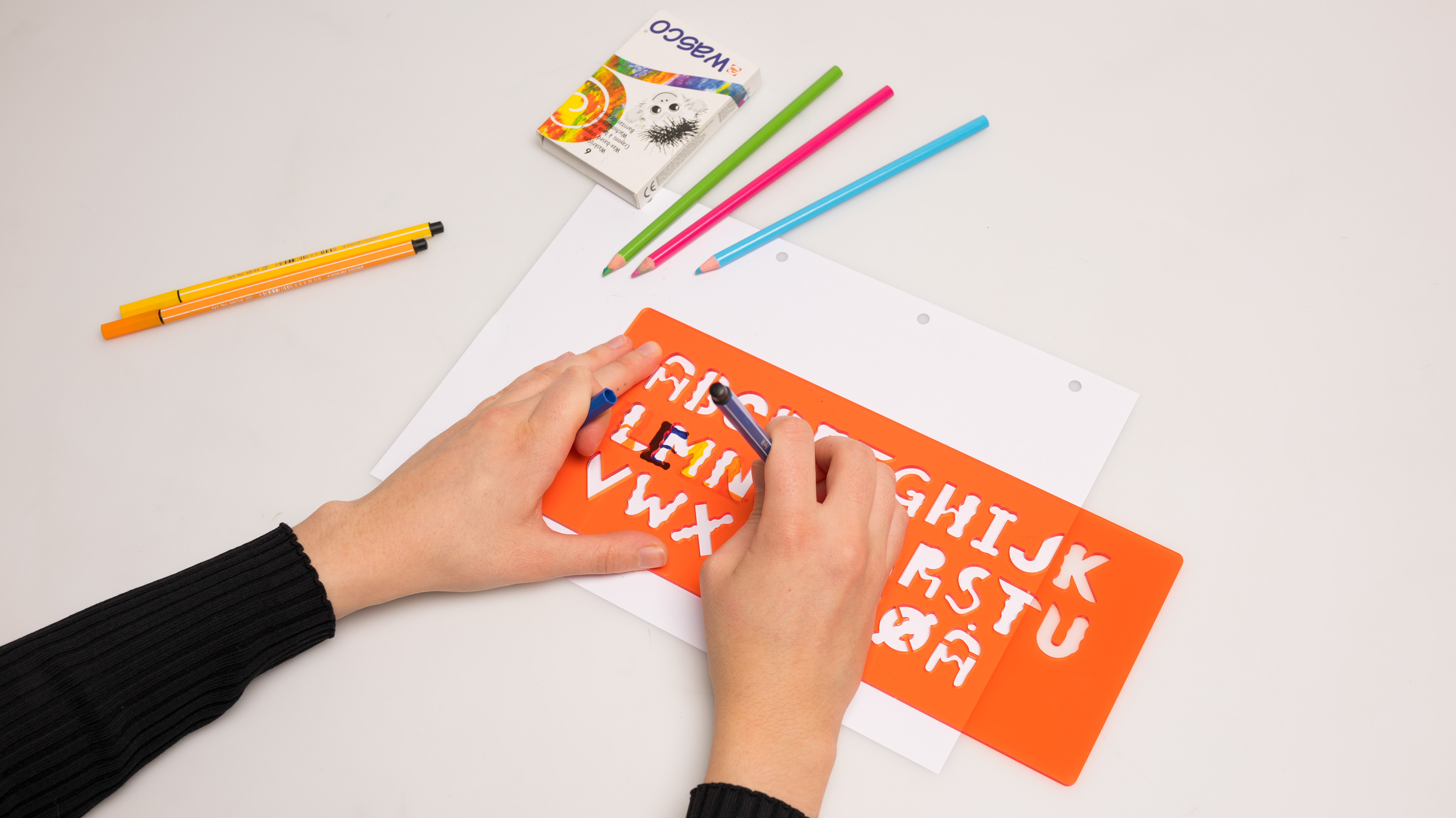
Photos of the process: 2 typeface workshops we did with the kids at the Ellekær youth club, providing them with different materials.
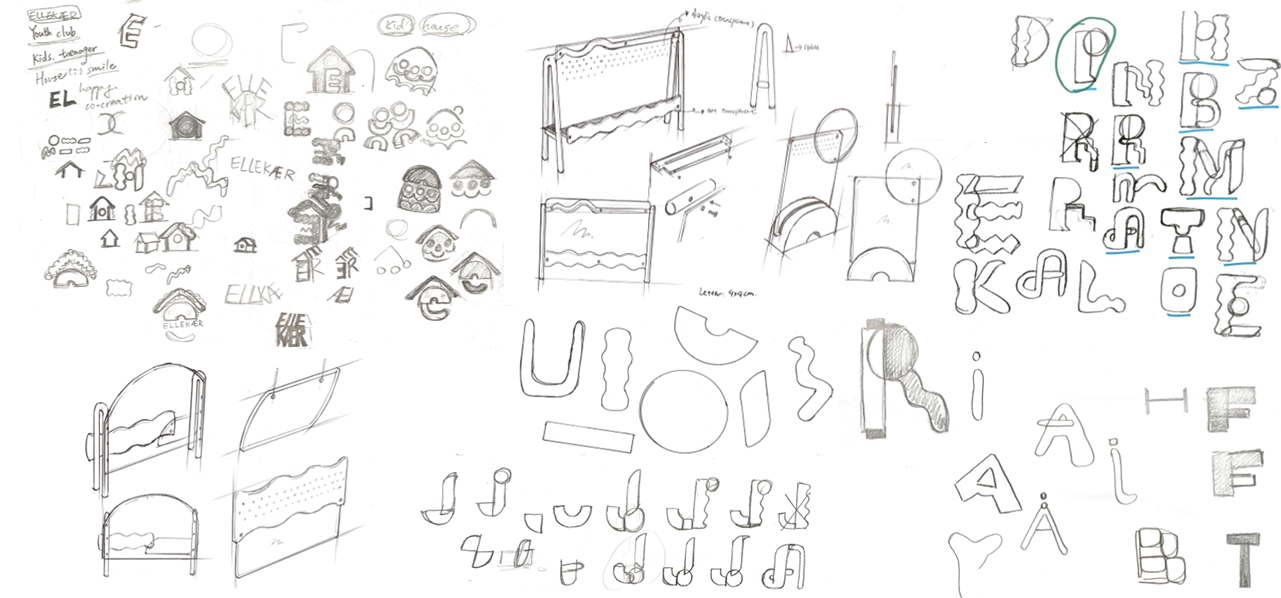
Sketches
Pencil sketches of the typeface, logo design and product design for the youth club.
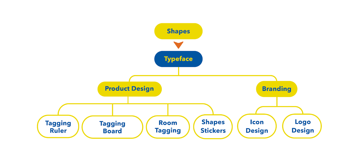
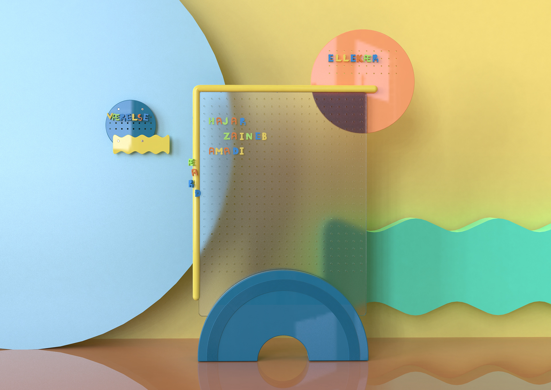
Outcome
Overview of the elements in the final solution.
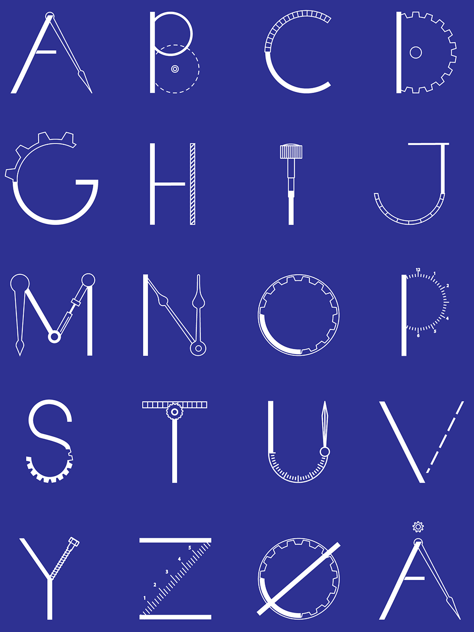
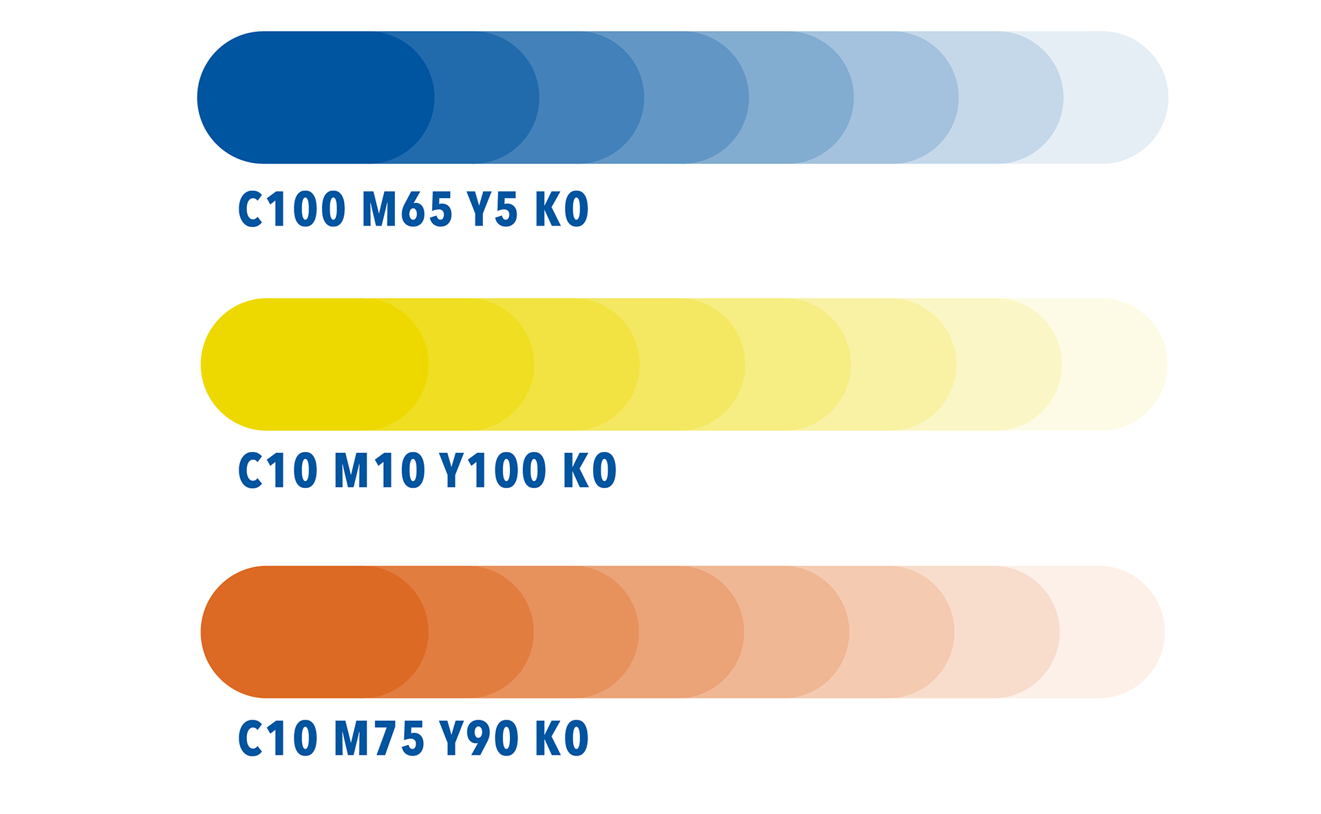
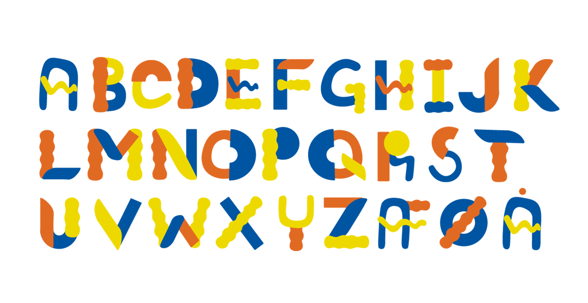
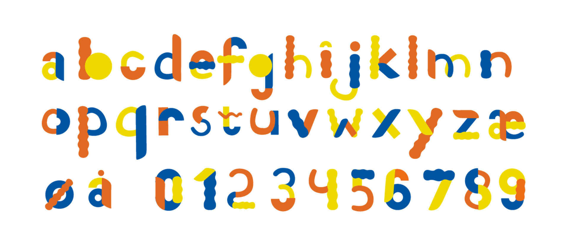
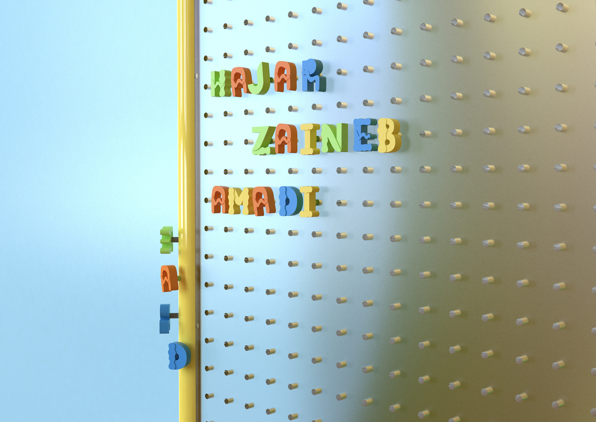
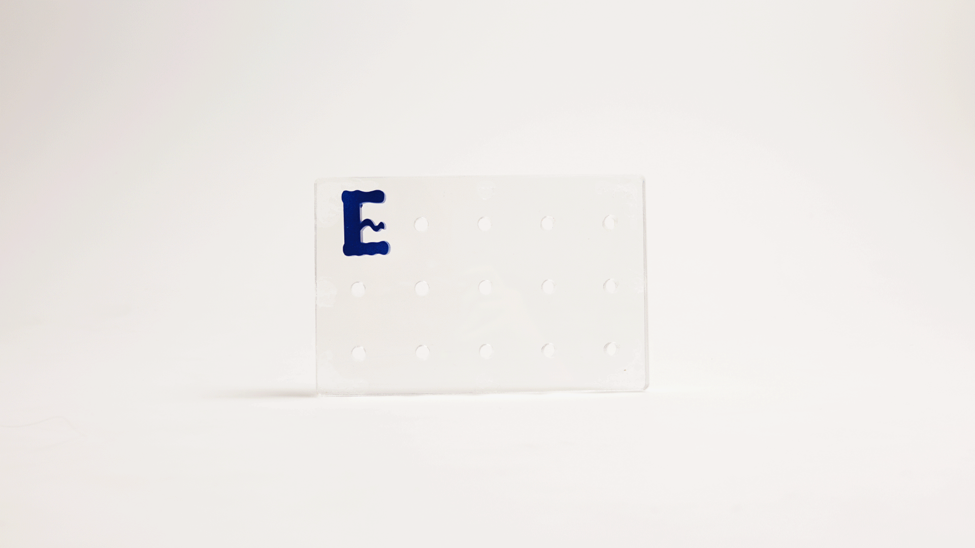
Typeface
The 8 basic shapes and color palette our typeface consists of. The visual choices were made based on our workshops with the kids from the Ellekær youth club.
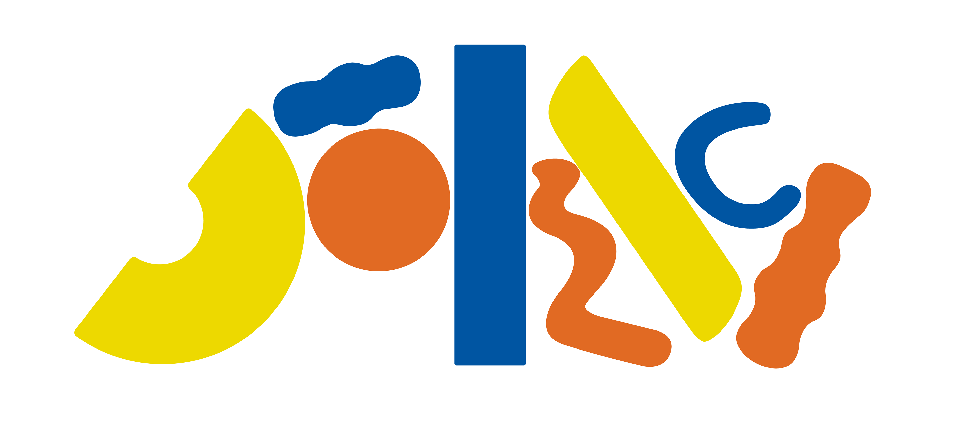
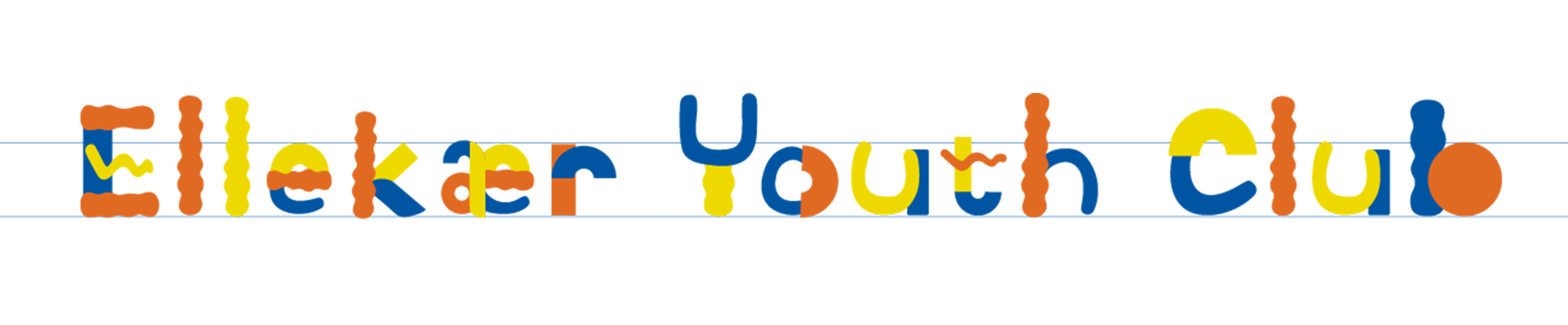
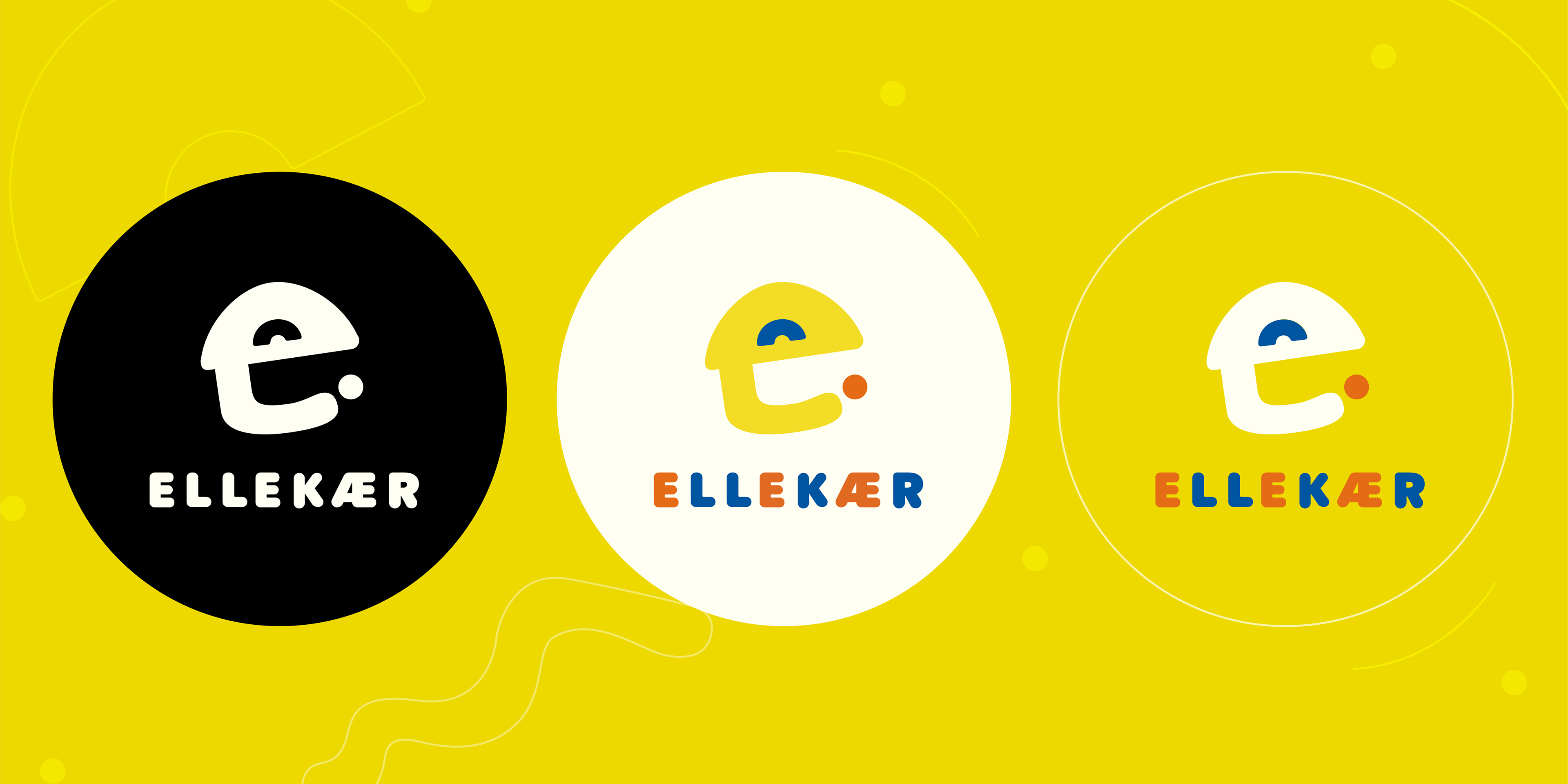
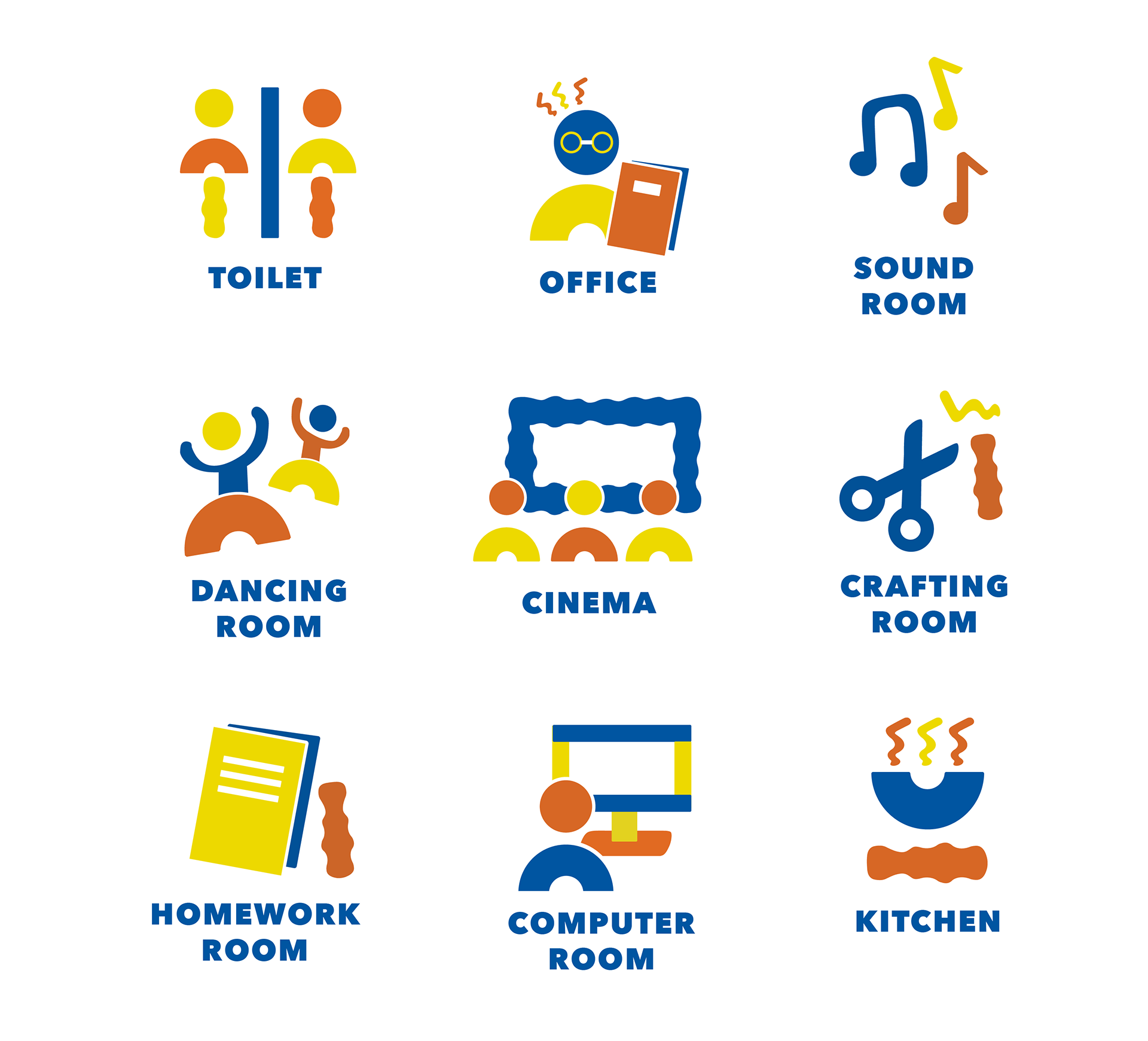
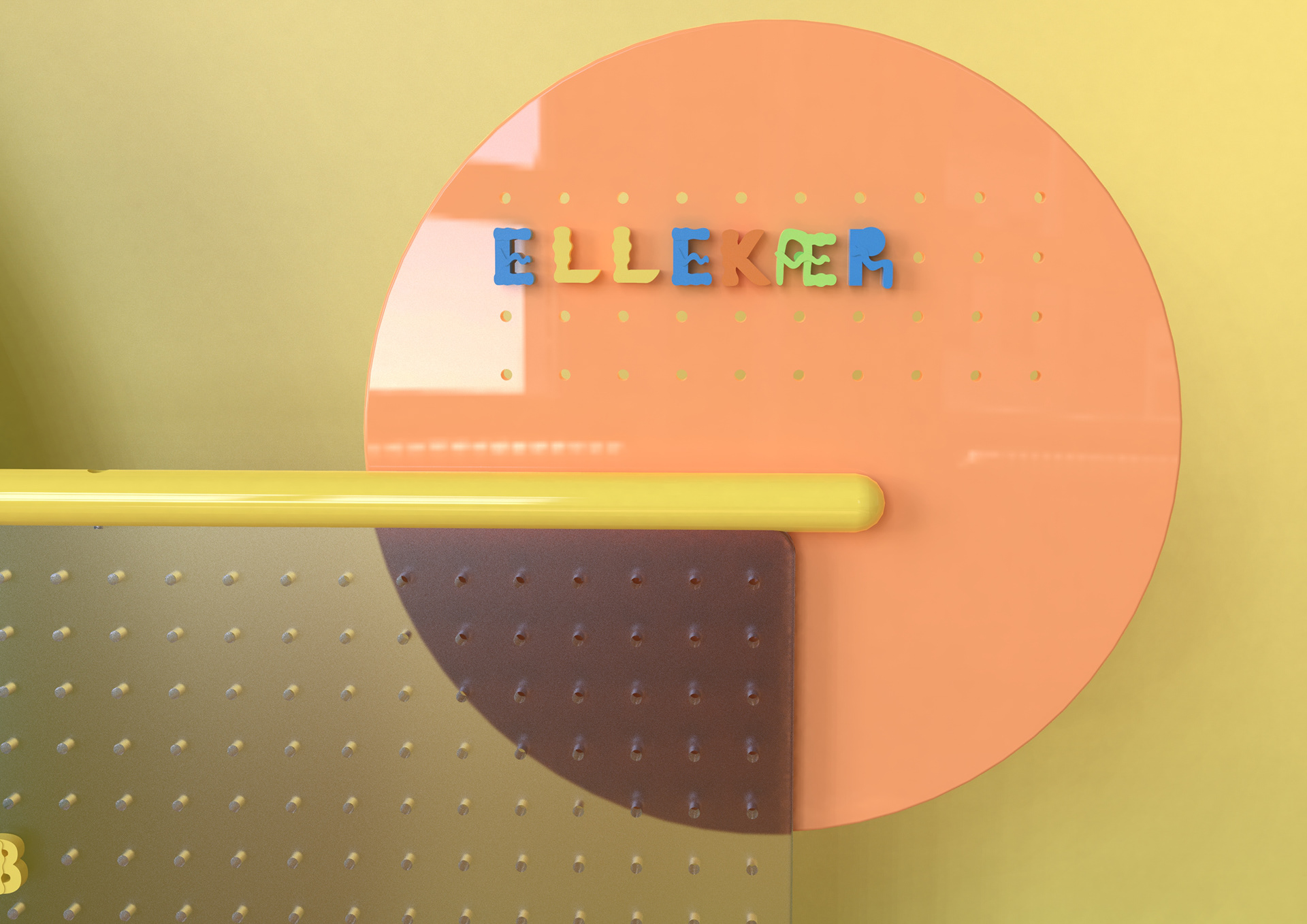
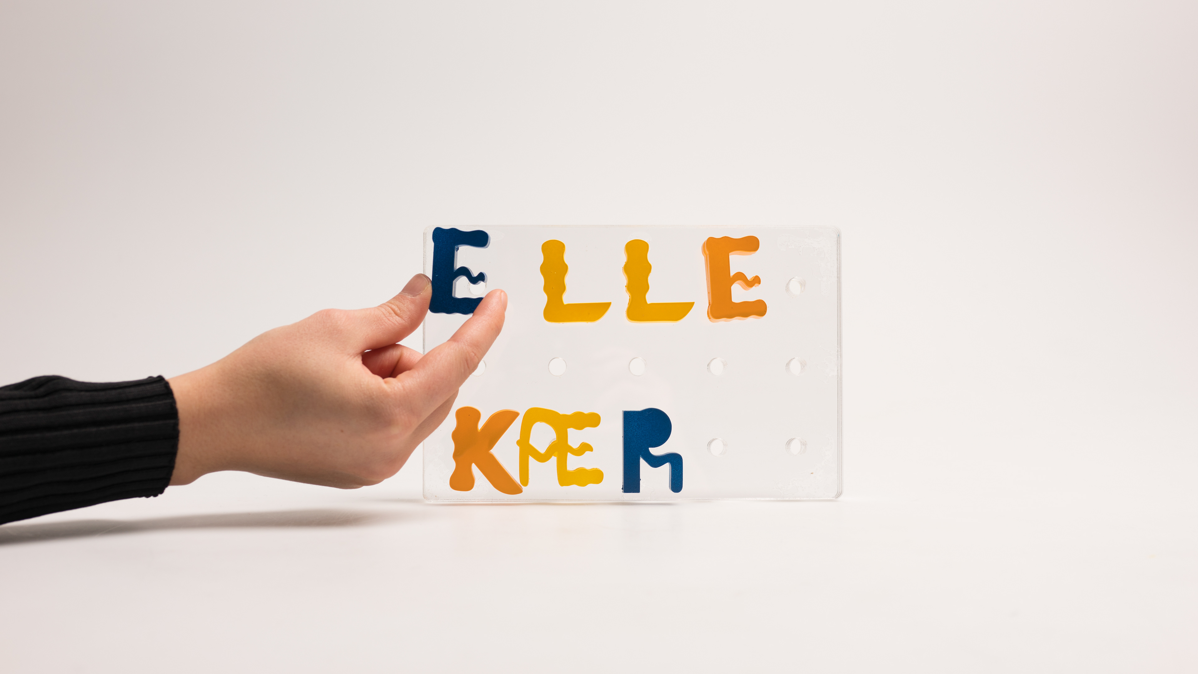
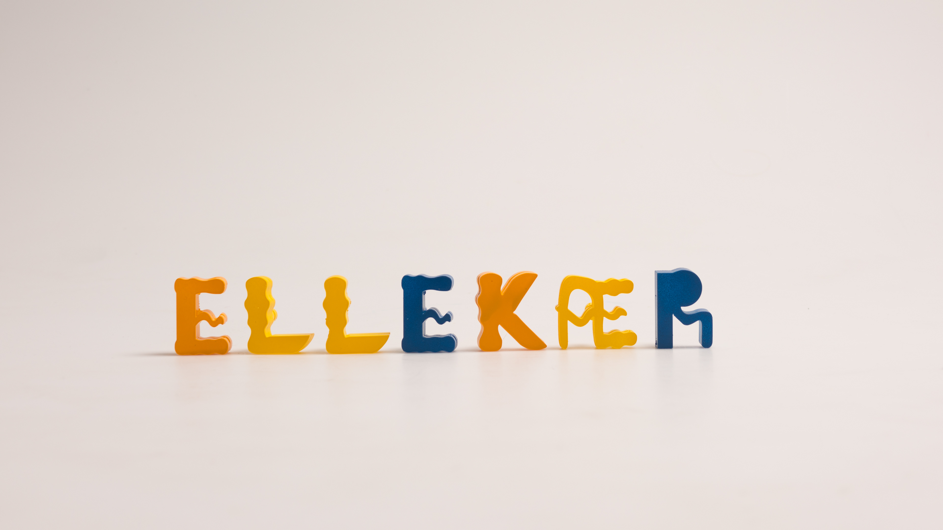
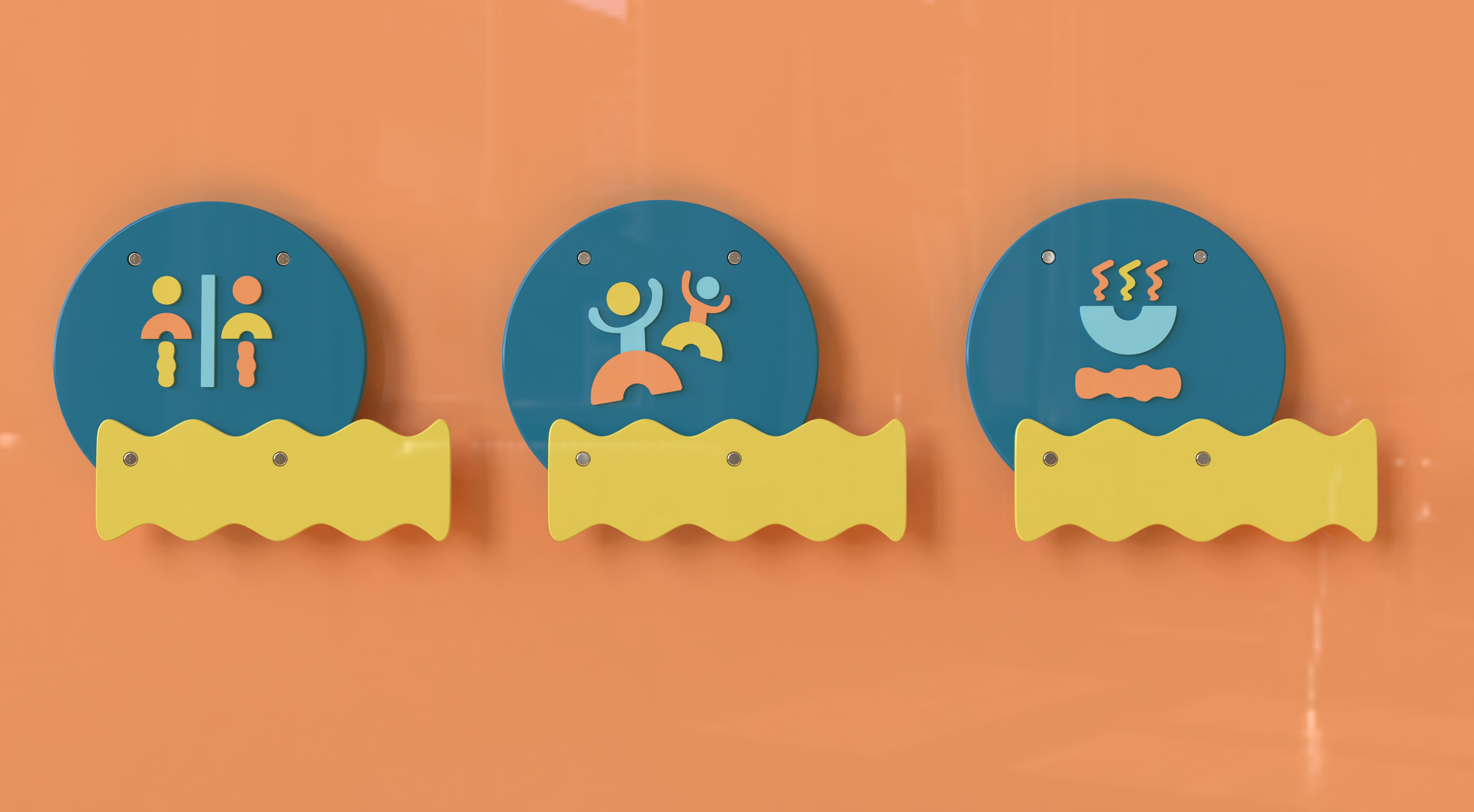
Branding
We have expanded the typeface above into branding with logo and icons for tagging different rooms at the youth club.
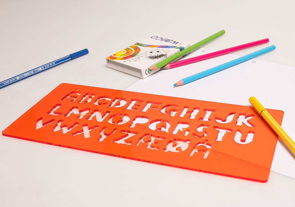
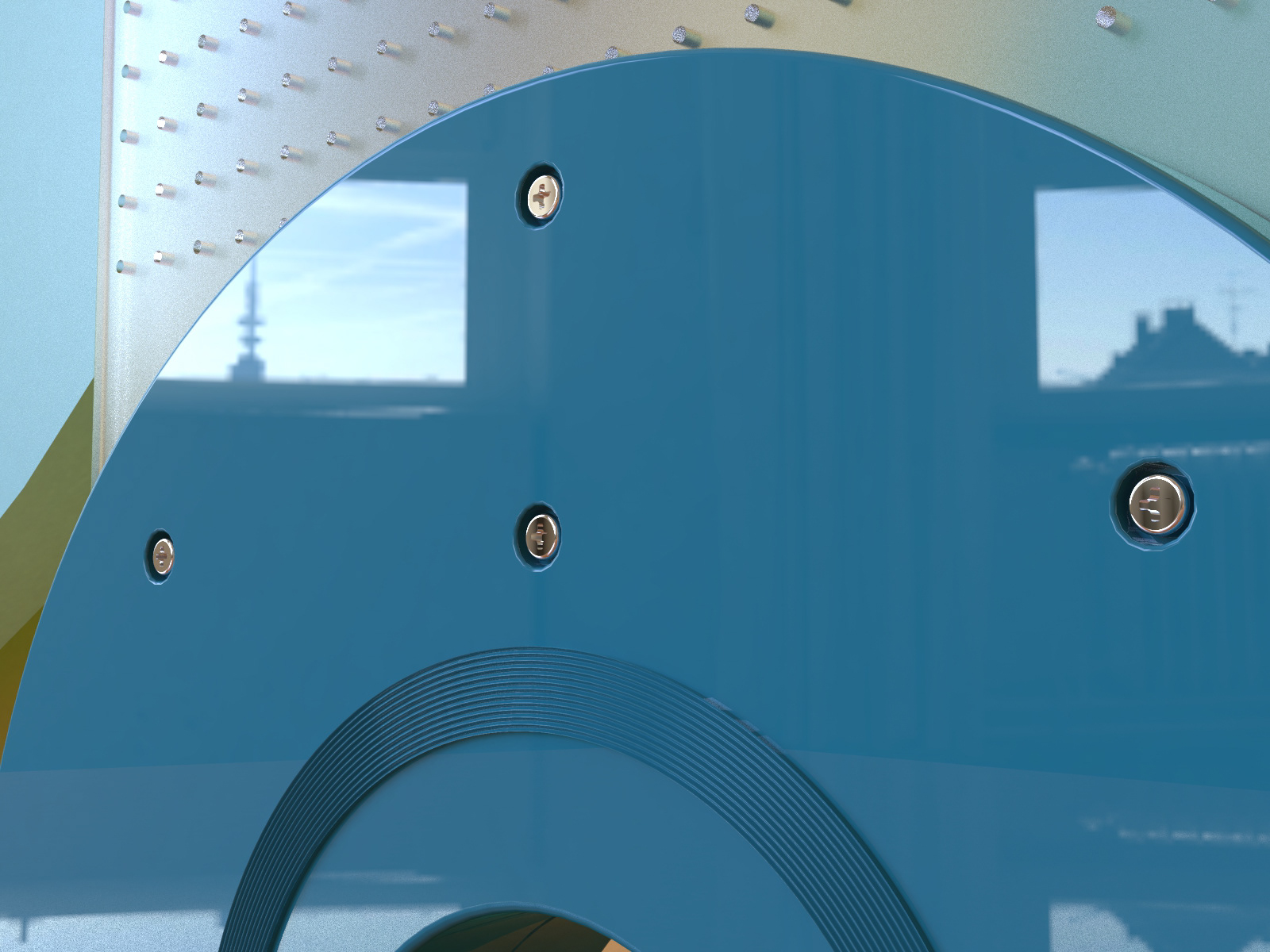
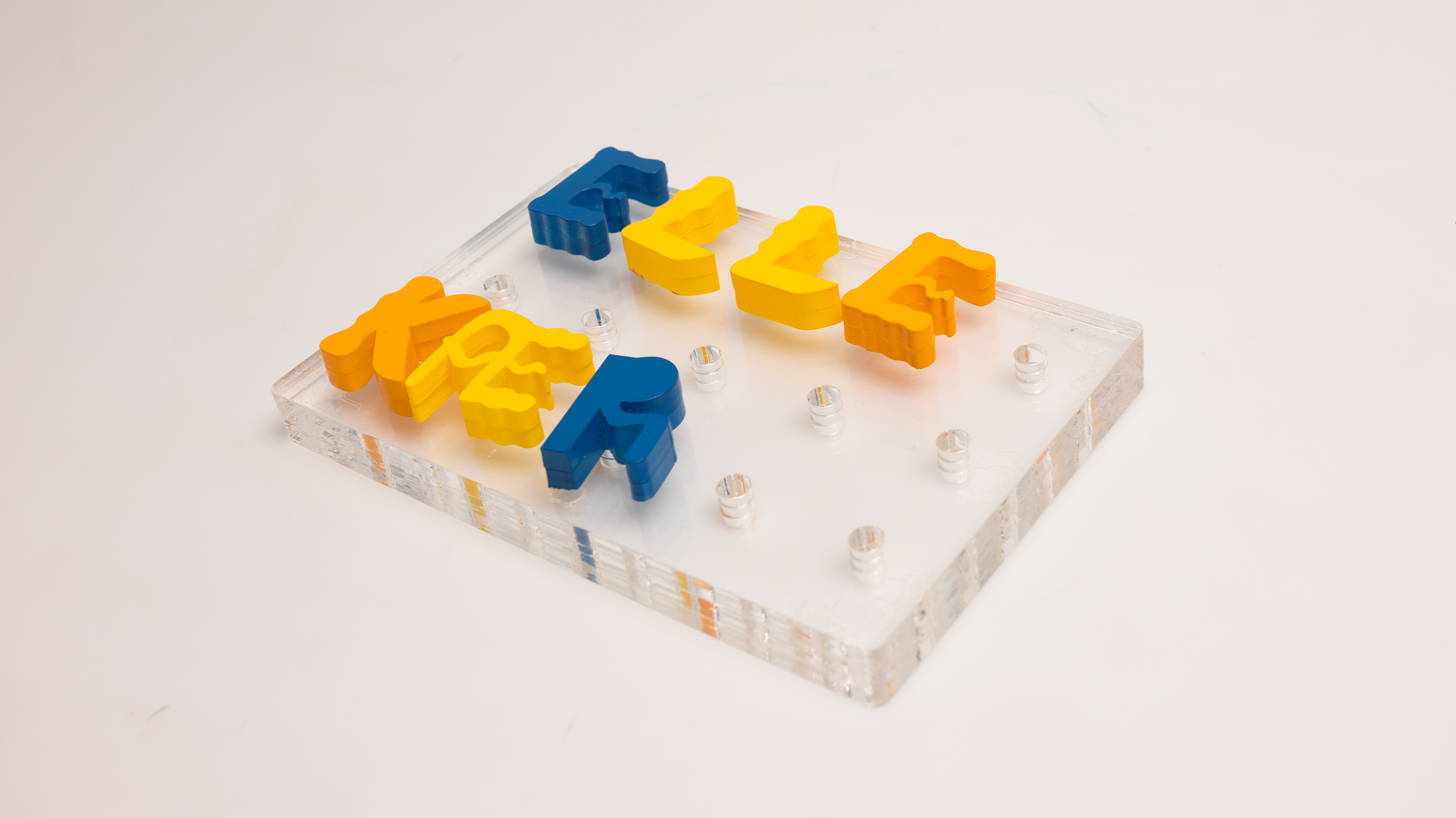
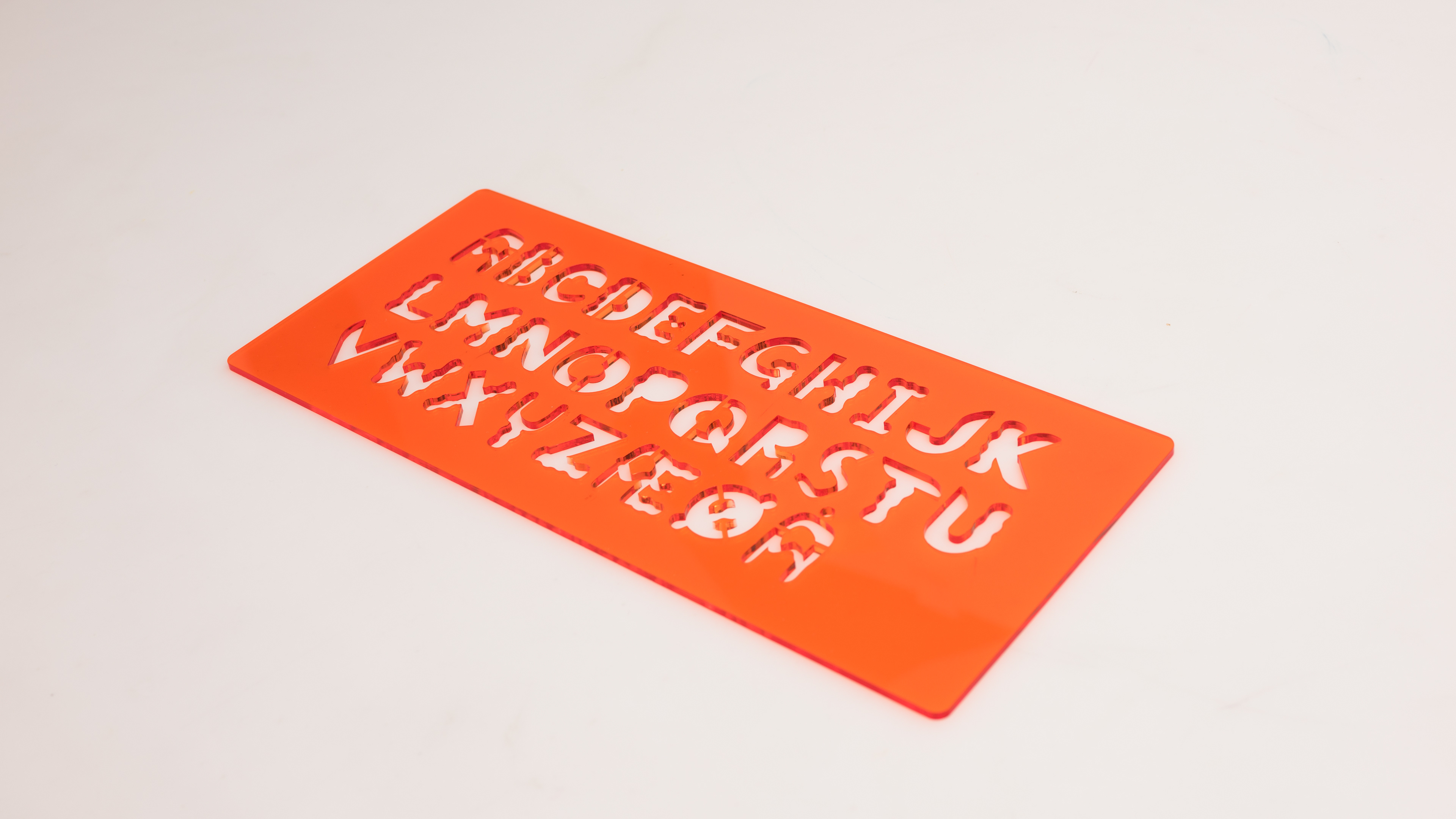
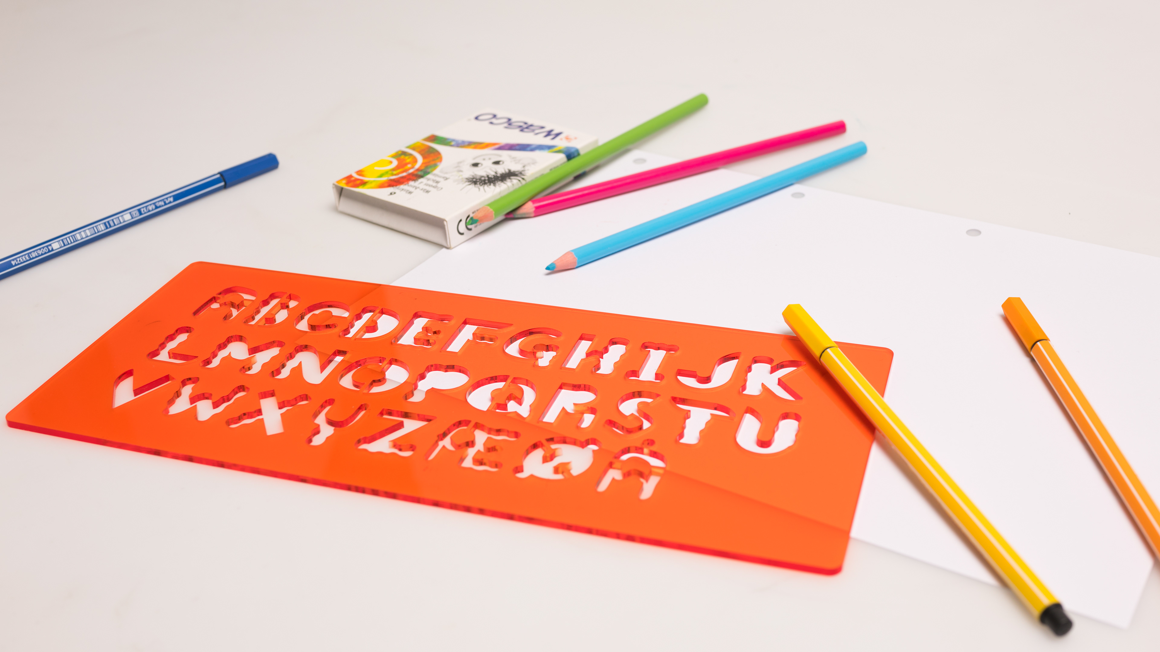
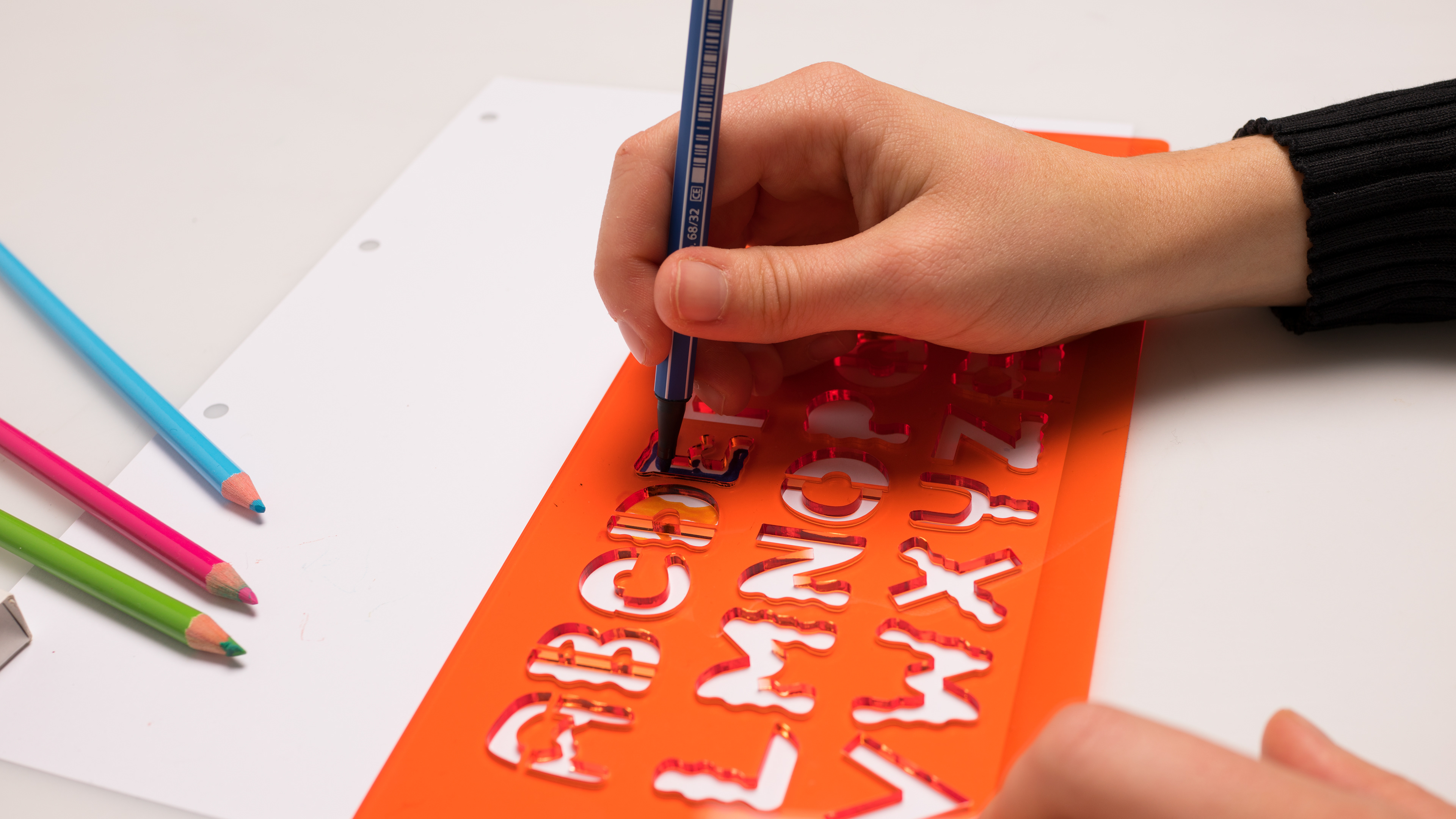
Product design
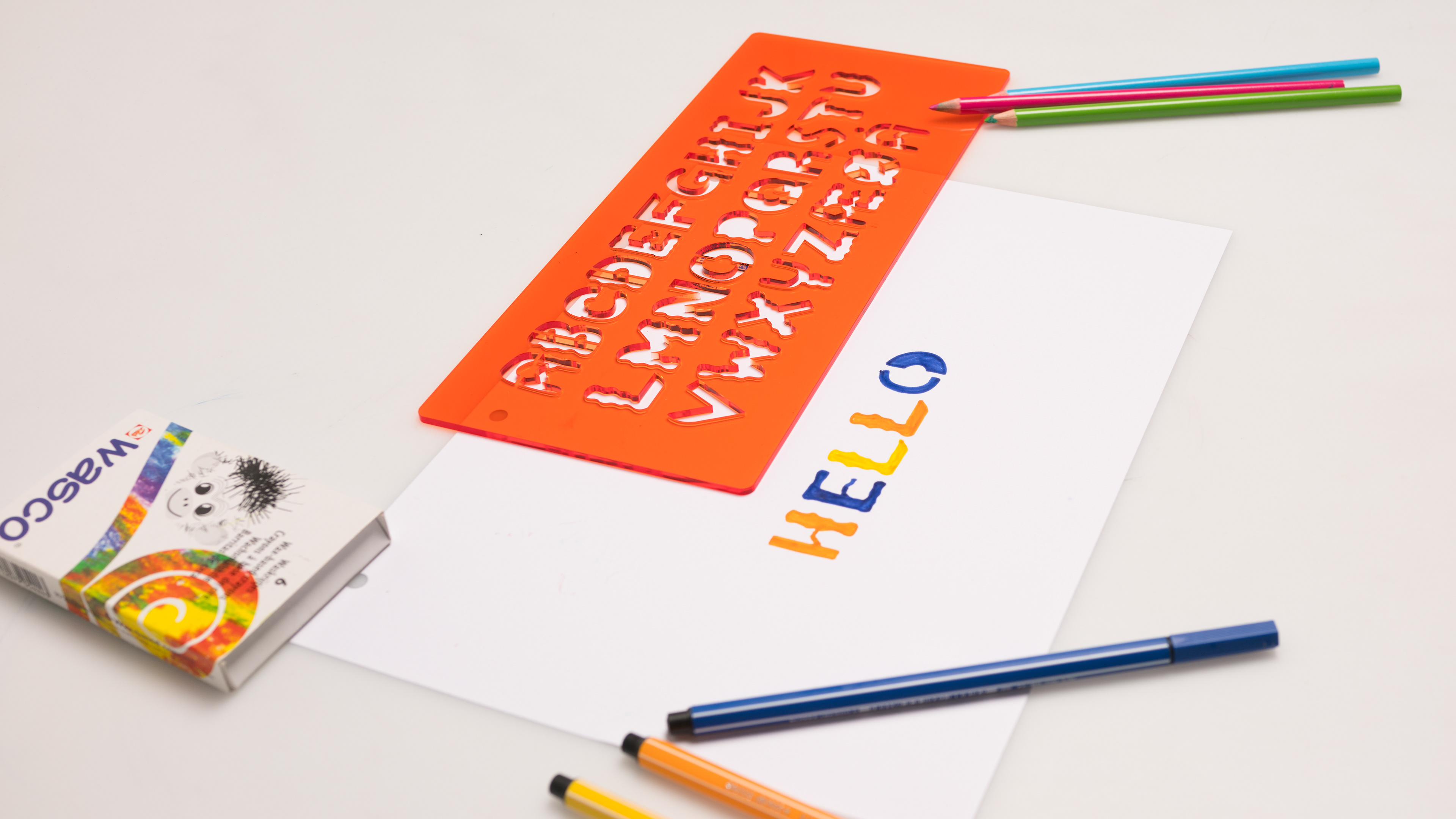
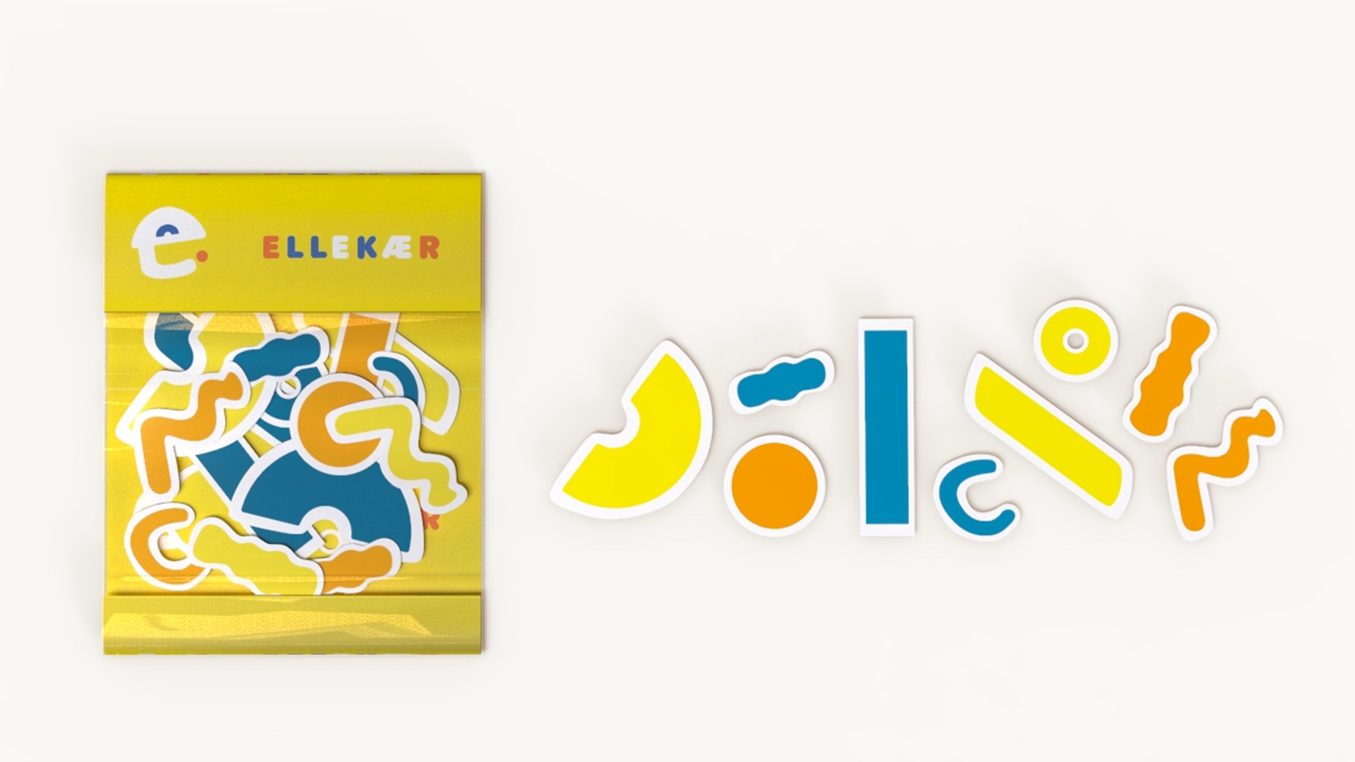
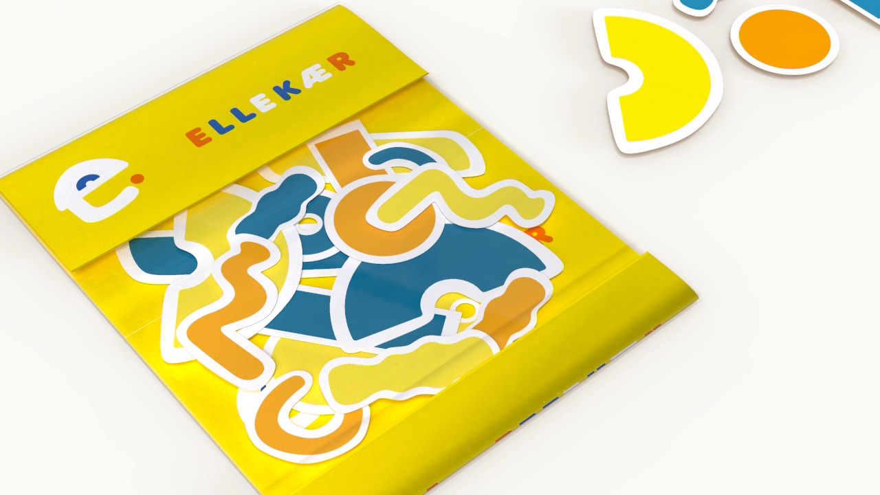
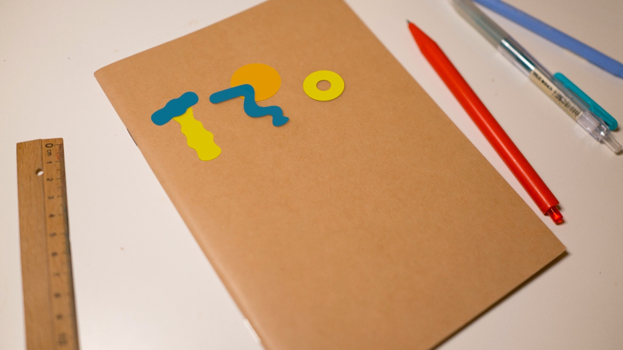
We have designed some products to enhance sense of identity at the youth club, as well as extend our branding to kids' daily lives, including tagging board, room tagging, alphabet ruler and stickers.
the end